How To Create a Lead Magnet With Visual Appeal To Get More Downloads
Even though most lead magnets are free you should still spend just as much effort on making it visually appealing as you would any paid product. It should be pleasing to look at, easy to read or listen to, and definitely very easy on the eyes while also including your branding so that there is no mistake about who the lead magnet is from when people who signed up are looking at it later.
In this blog post, I am going to share with you ways to make the lead magnet you create more appealing to your audience so that they want to download it. People are visual creatures and this is important.
1. First Impressions Count – Grab Attention With an Amazing eCover
Have you heard the saying, “Don’t judge a book by its cover?” Well, that isn’t true. We all judge an opt-in (or any book, planner, etc) by the cover, so make sure that yours draws attention.
Not only does your eCover have to be amazing, but so does the title.
Any cover should draw the eye and also convey what is inside. That is why the cover is important and you want to take some time on the design.
If you’d like to save time, you can create beautiful graphics with a free online image software online called Canva.
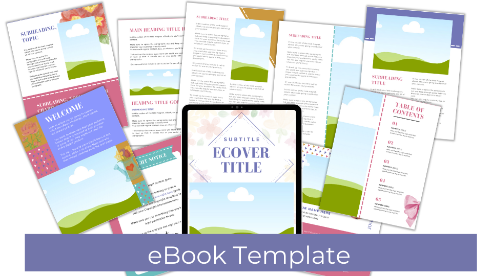
Take a look at some eCover Canva Templates below that we offer:
As for the title of your lead magnet – I like to brainstorm a list of different names. To do this start with words that you like or that work with what you’re creating. Also try to think of words that people seem to gravitate towards such as Profits, Easy, Quick, or Steps.
When I’ve come up with a name I like to use a software called Fresh Title. This helps with blog post titles, but I also think it works well for taglines and benefit sentences you can use on the lead magnet landing page.
One thing that I do is to look through lead magnets I’ve downloaded and see what other people have put as their titles. This I do as inspiration, not to copy.
2. Layout Of The Lead Magnet Will Help Your Customers Trust You
Not only does your cover count, but how things are formatted inside the free product matters too. You must work within the delivery method you’re using, but within whatever format that happens to be in you should be able to design the inside in a way that is appealing to your audience and represents your brand.
One of the best ways to help you make the inside of any freebie look good is a Canva Template. You can create your own, use the templates that Canva provides, or find a beautiful template that someone else has done the work and created for you to use.
With Canva Templates you’re able to change the colors, fonts, images, and elements quickly and easily. The software is easy to use.
RESOURCE: Canva Template Basics: Using Elements and Text Elements
When a lead magnet looks good, inside and outside, it helps build trust. The reason it helps build trust is that it looks professional and demonstrates that you care about your products and your customers whether they downloaded something free or not. This will help them know that your paid products are also very valuable.
You can do this with the Word or Powerpoint program. You can also use your Google account for free.
3. Show People What They’re Getting
Even though people purchase digital products, they still want to “see” what is inside because the truth is that most people either buy things based on the packaging and looks. This is why graphics are SO essential to the success of your freebie.
One way to do that is to help them visualize what they’ll get inside the digital product you’re sharing by creating mockups of the product. There are a few ways to do that.
- You can make your eCover look 3D. This represents a hard copy book and is very popular. You can do this for free online, but there is software you can use that only requires a 2D eCover graphic that you upload and it will publish the 3D look. It is called eCoverAuthority. You pay for it once and then you can use it forever.
This is what you can create with this software:
Not only do they purchase by the cover, but they also buy digital products that showcase the product. This includes what is inside. You can see what eCoverAuthority can do for your products above, but another graphic that is important is the marketing material mockups. These will help you share your products quickly and easily.
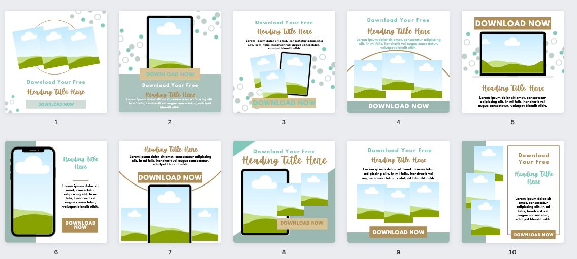
- You can get Canva Templates that will help you do that. You can use the graphics you created in eCoverAuthority and replace some of the image graphics (shown below) or you can upload images of your product to Canva and drag and drop the images into the image elements like the ones below.
If you don’t know how to lay things out, format the products, or are having issues trying to do it yourself don’t be afraid to purchase Canva Templates to help.
It’s will be worth the time you save. You can go to our Canva Template SHOP and browse all that we have to offer, pick a look that you like, purchase it, and start using it right away.
You won’t have to worry about finding someone to do the work, the back and forth it takes to get them to understand what you want, and then the days (or weeks) it takes to get the work back.
BONUS: Don’t Forget To Create an Attractive Landing Page Or Opt-in Form
Before they even download the lead magnet they’ll see a landing page and/or an opt-in form. That should also be made with the utmost care to appearances. How this is set up matters because if it’s clunky or unattractive people may click away. It’s easy to create amazing and effective landing pages and opt-in forms using your own website.
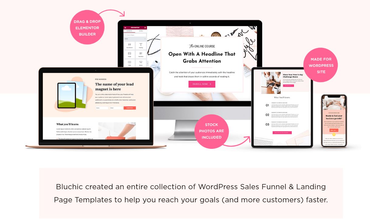
I use Architect from Thrive Themes with WordPress. Another option would be Elementor. I like this drag-and-drop WordPress software because some features are free to use and then you can purchase themes, landing pages, etc from third parties such as Bluchic.
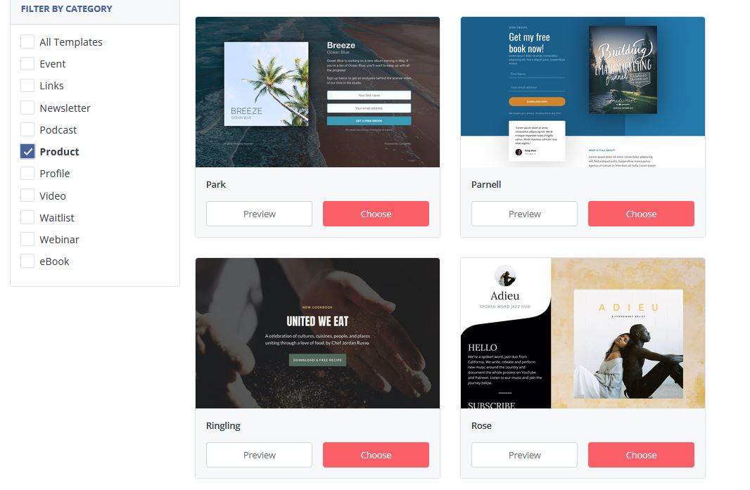
Another option is to use the landing pages from ConvertKit. This is a great option because you can set up the landing page, as well as the email sequence (thank you and download email) all in one program. ConvertKit even has an option as a shopping cart, but I’ve never used it and I don’t know how it works.
Finalize Lead Magnet With Help From Your Audience
Once you have a couple of ideas for covers and designs for your lead magnets a great way to get your audience involved and see what they like is to ask your current audience. You can do this through email or on Facebook. Give them two options and ask which they like better.
Asking your audience is a great way to finalize a design idea because these are already your customers and it’s likely that others will enjoy the design too if they do.
Conclusions On How To Create a Lead Magnet That Is Beautiful
Just remember that if your visuals aren’t up to par with what your audience is expecting they might not even consume what you’ve created therefore not receiving any of the benefits. So make sure that you make your products visually appealing and results-driven.
Also, remember that getting something out into the world is better than perfect; therefore, it is more important to get a freebie out there that is ugly than none at all. You can work towards providing creating a visually appealing lead magnet for your audience.
~April


